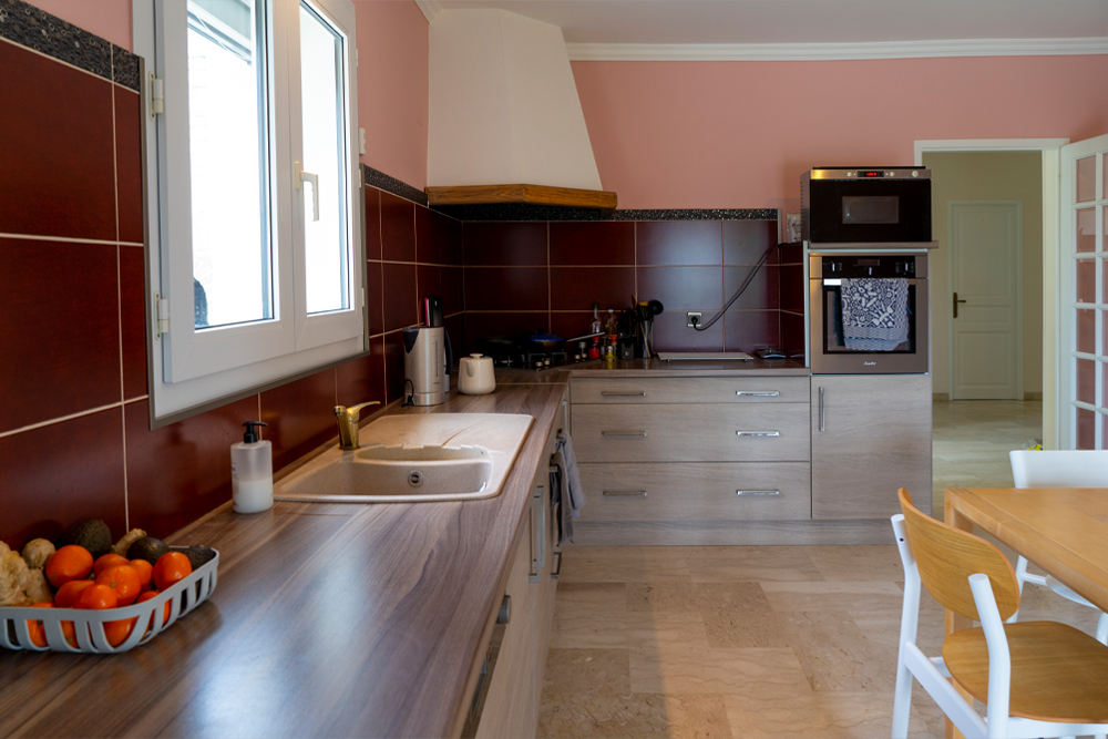
Maybe you believe that I was charmed by this villa because of the pink kitchen walls? Well, it may come as a surprise: but no 🙂 The old pink walls have a strange undertone and look old fashioned, so we’ll paint them soon. Worse than the wall colors was the kitchen backsplash with dark red tiles and black border tiles. We were having dinner in our first week here and I couldn’t look at them. They made the entire kitchen so dark and ugly. And check out the black glitter border… there was even a black sign on top of the rim with the very creative word “Cuisine” that we tossed out the second we moved in. Anyway, these tiles had to go! At the same time: the entire kitchen is recent, in good shape and good quality. But it’s not our style at all. So for now we decided to live with this kitchen for a while until we determine what we’ll do. And that’s where Smart Tiles comes in: the super realistic stickers allow you transform your current tiles into more contemporary look. They are ideal when you’re renting and cannot modify anything in your kitchen or bathroom, or when you’re like us and don’t want to carry out a big renovation just yet.
The kitchen when we first visited:
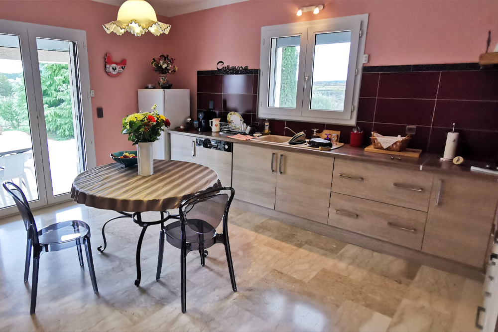
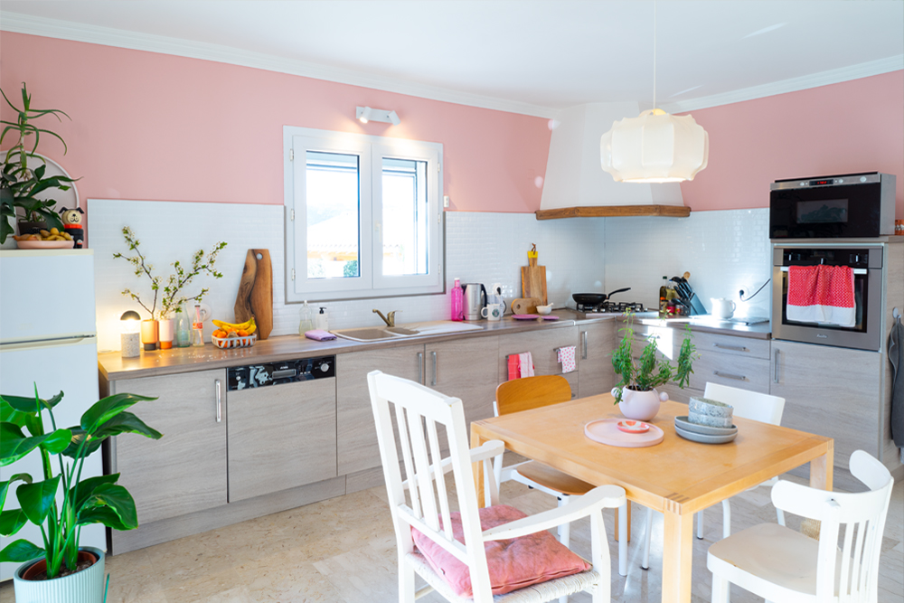
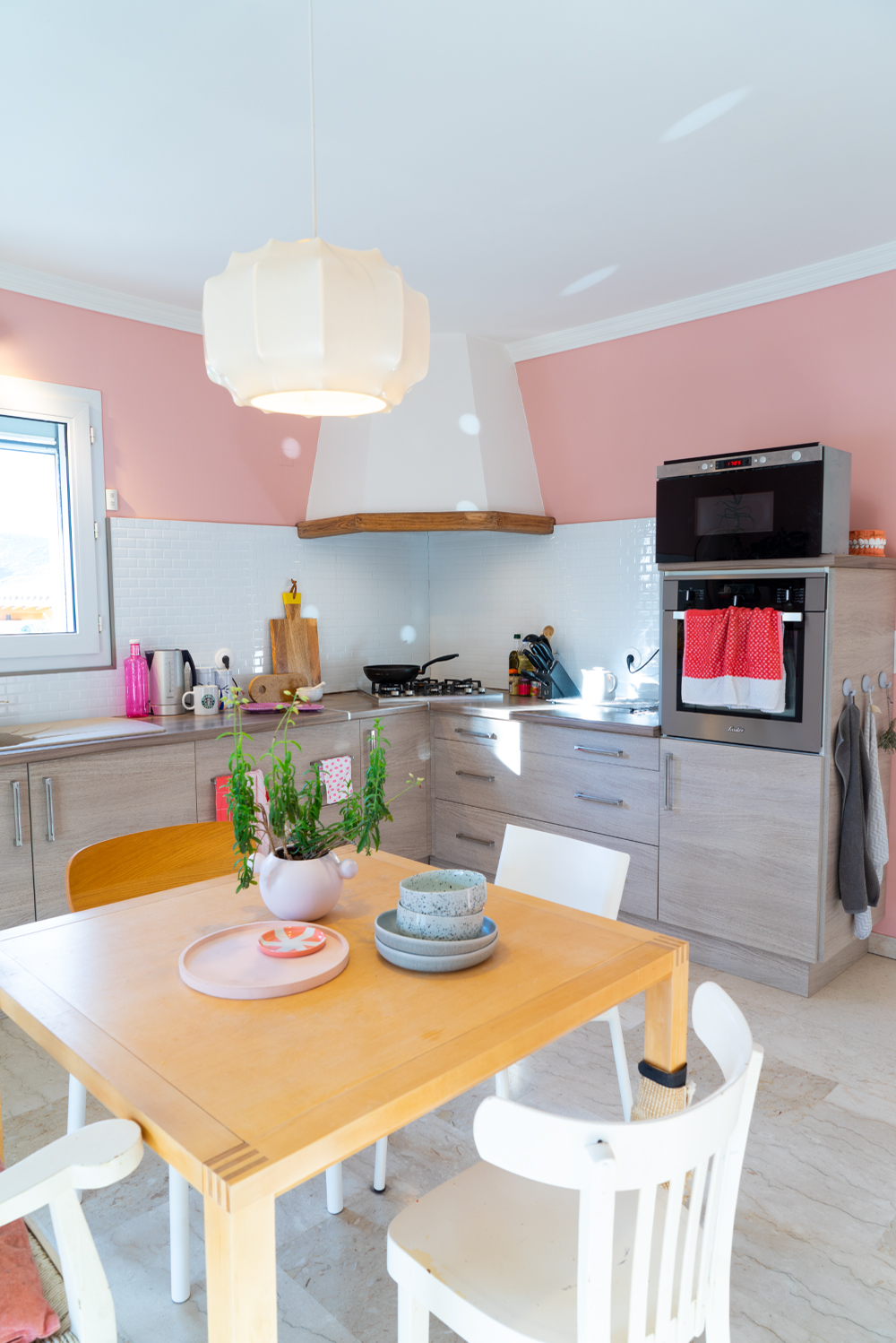
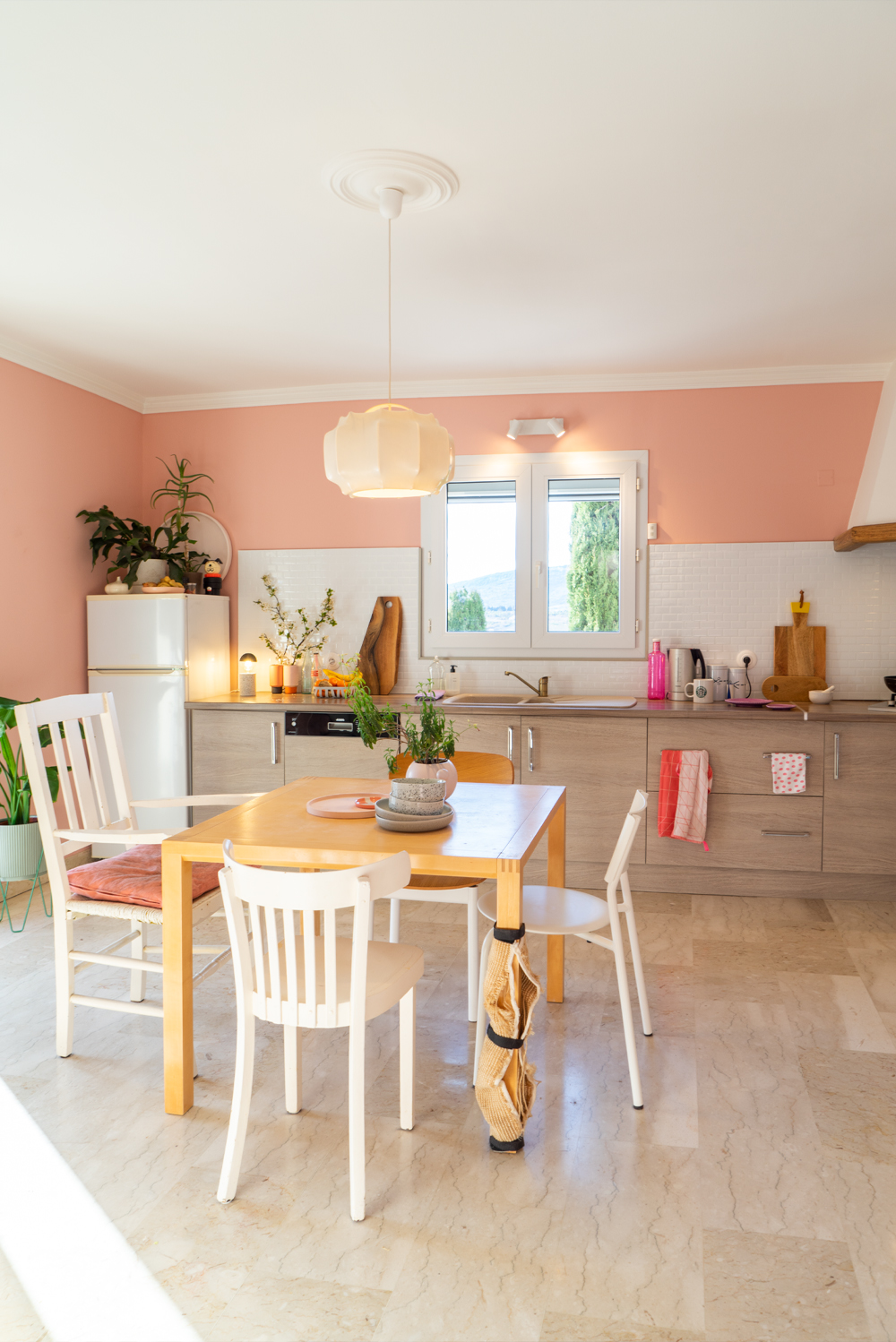
Below the kitchen when we just moved in, all the previous’ owners’ decor is gone, and we added our own furniture. The largest chair was my grandfather’s chair, paired with my childhood kitchen chair, a Mycs Pryme chair in white & oak and a TipToe SSDr chair in white.
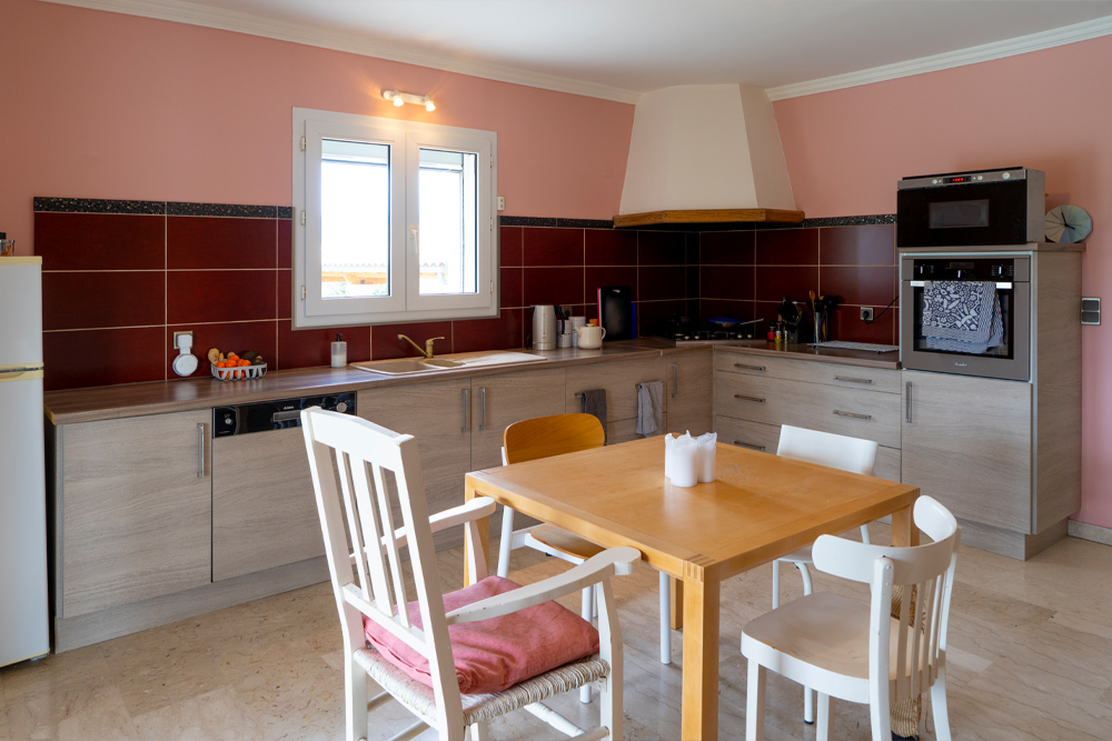
The kitchen is spacious and feels super cozy: for the first time in a long time I can watch Robert cook and there’s enough space to have lunch or dinner here with two friends or family members when we can do this again… hopefully soon.
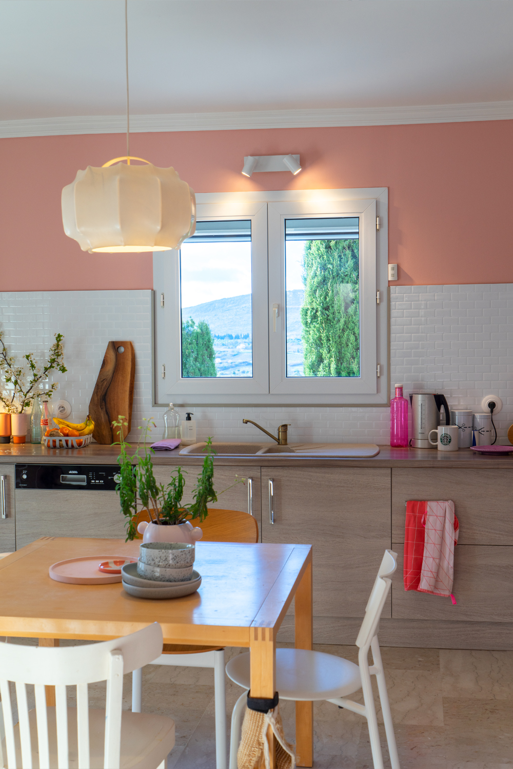
And then: one of the main reasons to change the tiles: they are the “frame” of the best painting in the house: our million dollar view!
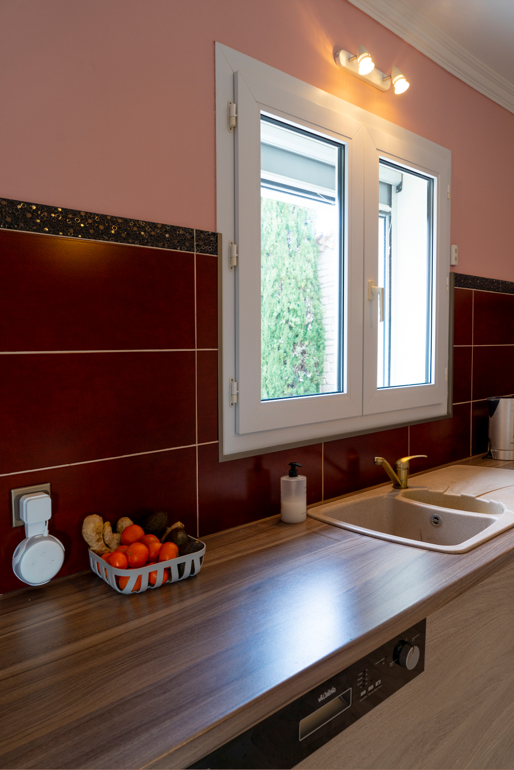
I mean look at this: our everyday view from this kitchen window:

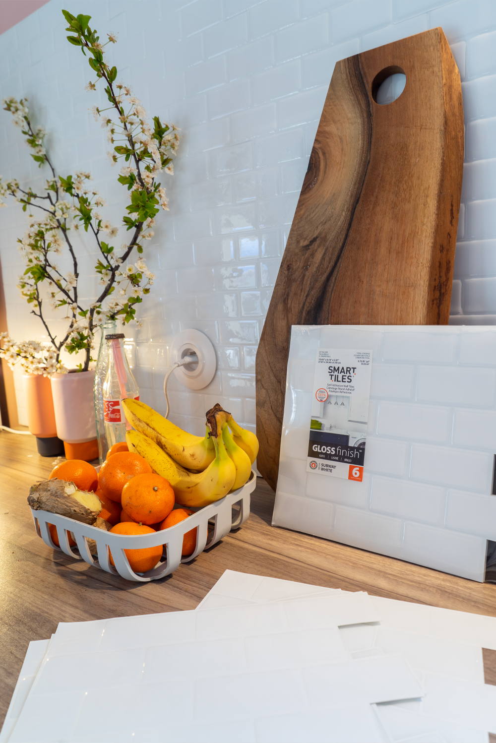
You’ll understand these dark red tiles don’t do the view any justice. So I’m very happy that Smart Tiles accepted to work with me. I had heard of Smart Tiles before (in France you can find them at Leroy Merlin and Castorama stores) and was pleasantly surprised when the package arrived: the stickers look super realistic. From all the options like hexagon tiles, natural brick tiles, classic natural stone tiles, I picked the white subway tiles. They have a contemporary and sleek look.
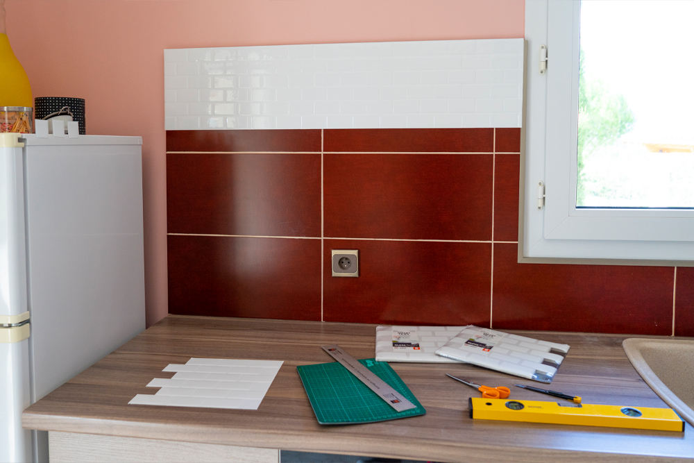
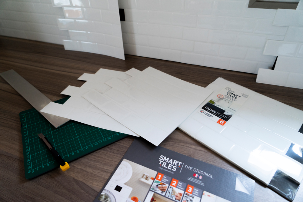
Applying the Smart Tiles is really easy: after cleaning the surface thoroughly, you start with one sticker and then apply the next one, partly on top of it, in a straight line. I used a cutter, scissors, a ruler and cutting board. And when I messed up the position of a sticker I could easily reposition it. For the electric sockets I measured the exact positions and cut them out. It took me an afternoon to apply the entire blacksplash as it’s pretty big, but the result it very impressive. When cooking dinner the first evening, Robert asked if I had changed the lighting in the kitchen, because it was SO MUCH brighter.
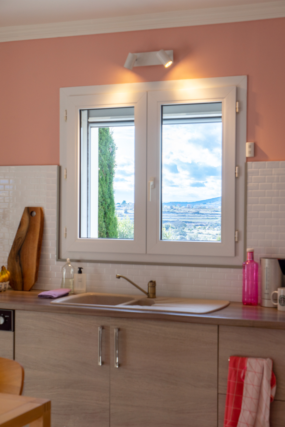
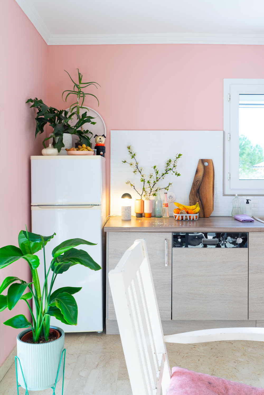
Check out the new frame or our view. Doesn’t this look 1000x better?!
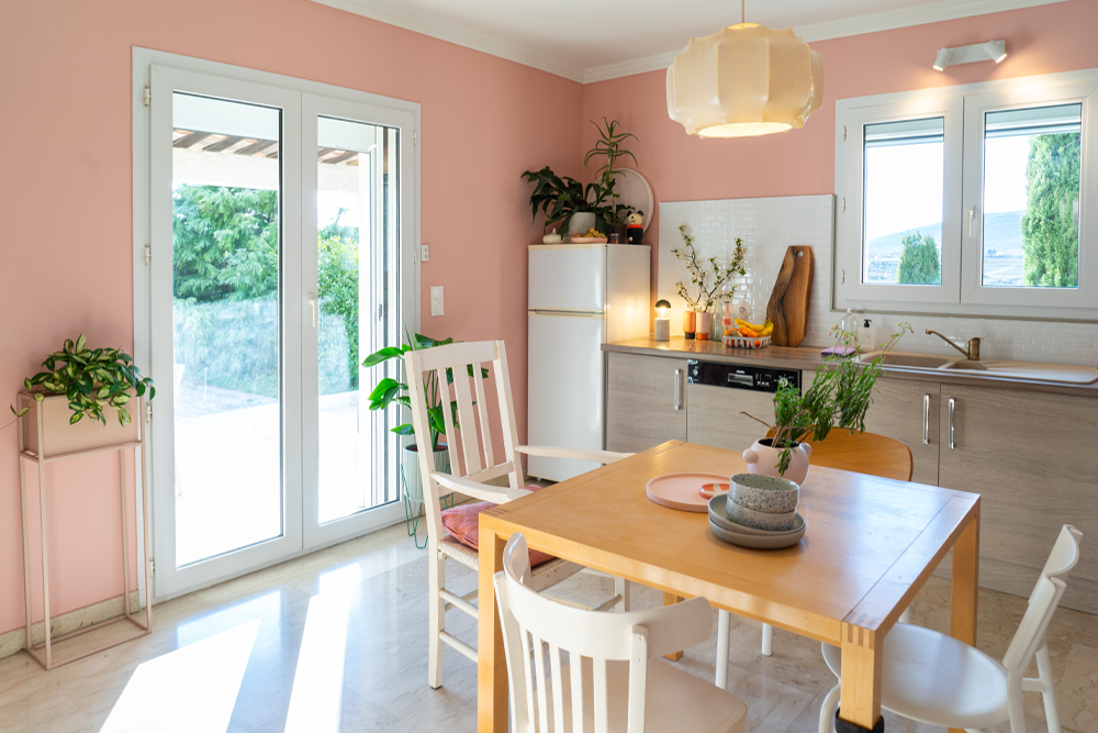
Instead of a dark uninspiring kitchen, our kitchen now looks much better! I think it is really impressive how simply changing the tiles completely brightened the space. Of course the abundance of sunlight here in the South helps, as well as the glossy look of the Subway tiles.
The discoball in the living room reflects into the kitchen:
For now the kitchen looks a bit too pink to us, but we just ordered samples with some contemporary paint colors. Of course I will show you that as well. If you want a little sneak preview of the potential colors, check my Instagram Stories as I’ll probably share the samples there first.
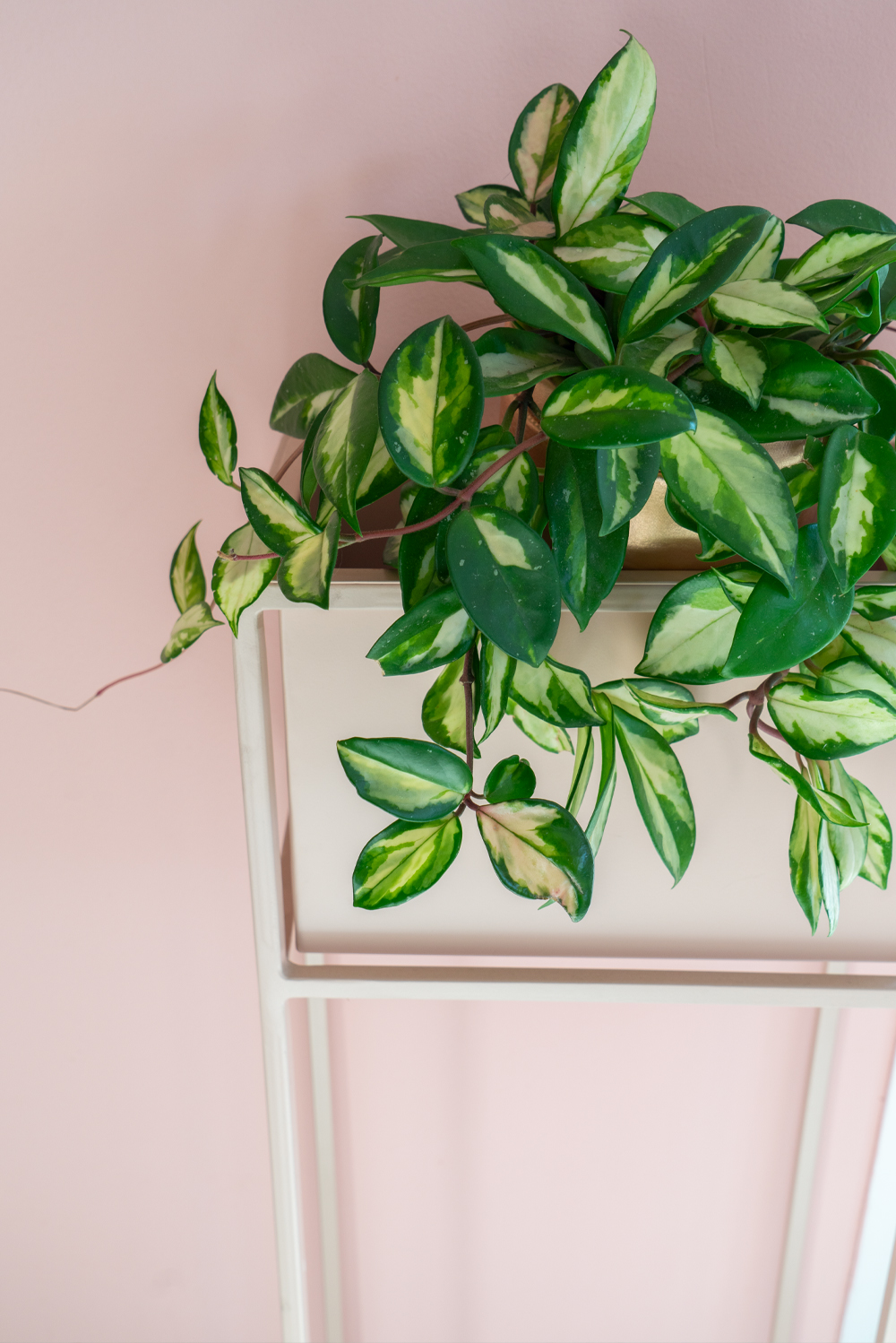
Is there really such a thing as too pink? Well, the Hoya carnosa tricolor blends in pretty well anyway!
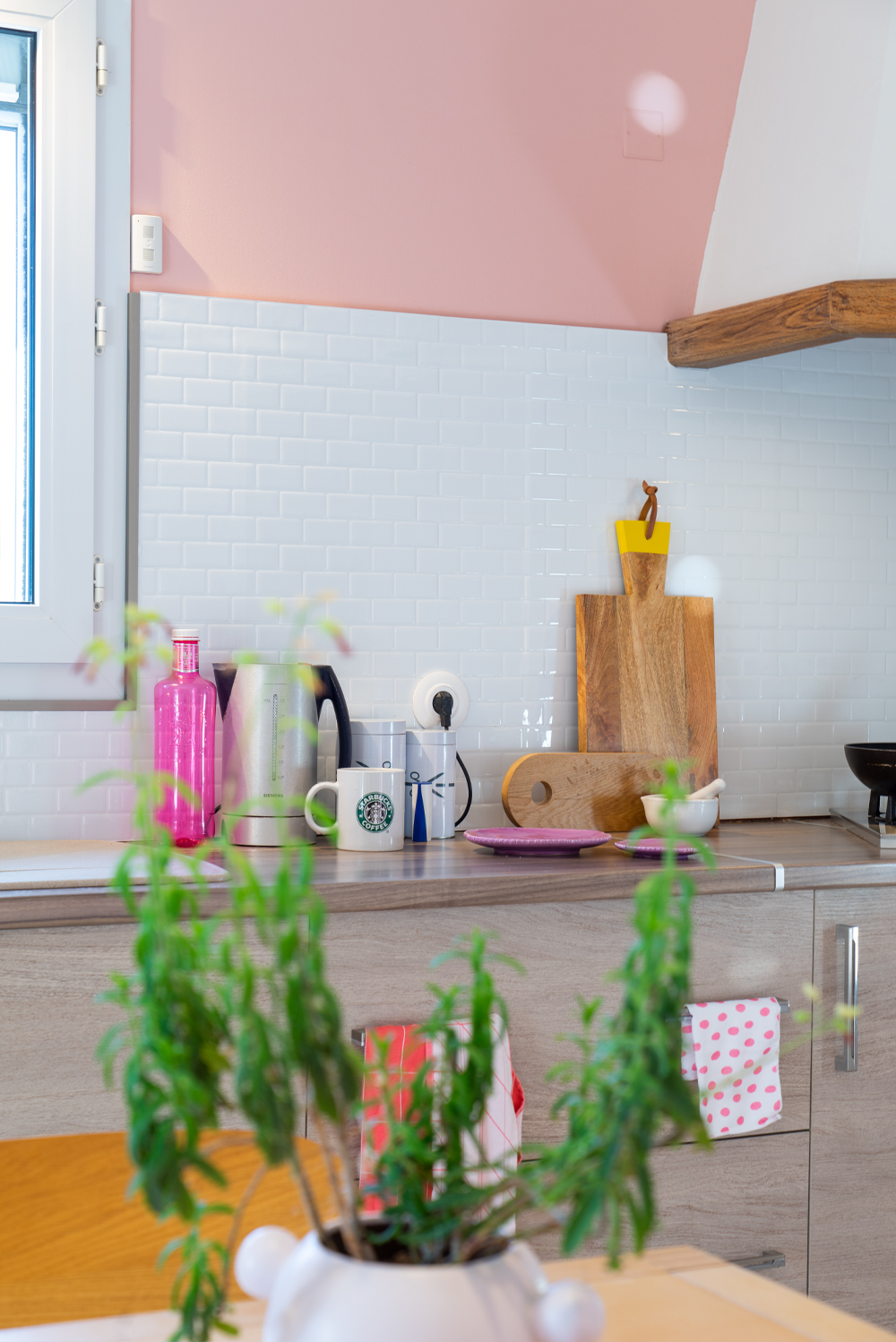
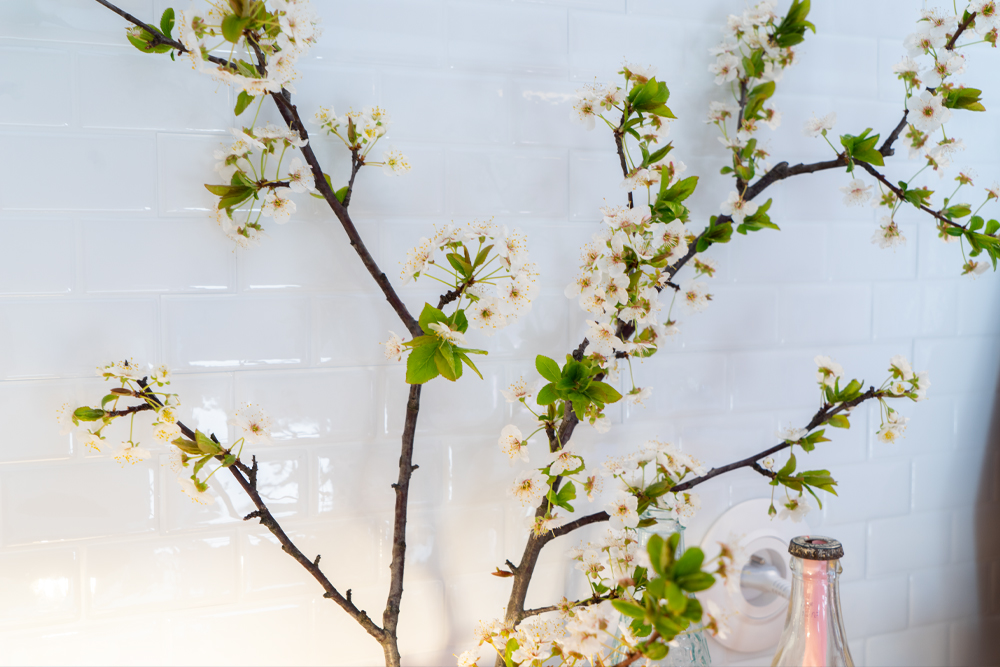
Have a look at what the Smart Tiles look like from up close: they have this glossy tile look with its’ imperfect subway tile reflections. I expected the edges between the stickers to be very visible, but they’re only visible when you watch from very close. It’s a pretty good imitation of real tiles, I’d say!
Do you even remember this? Before:
After:
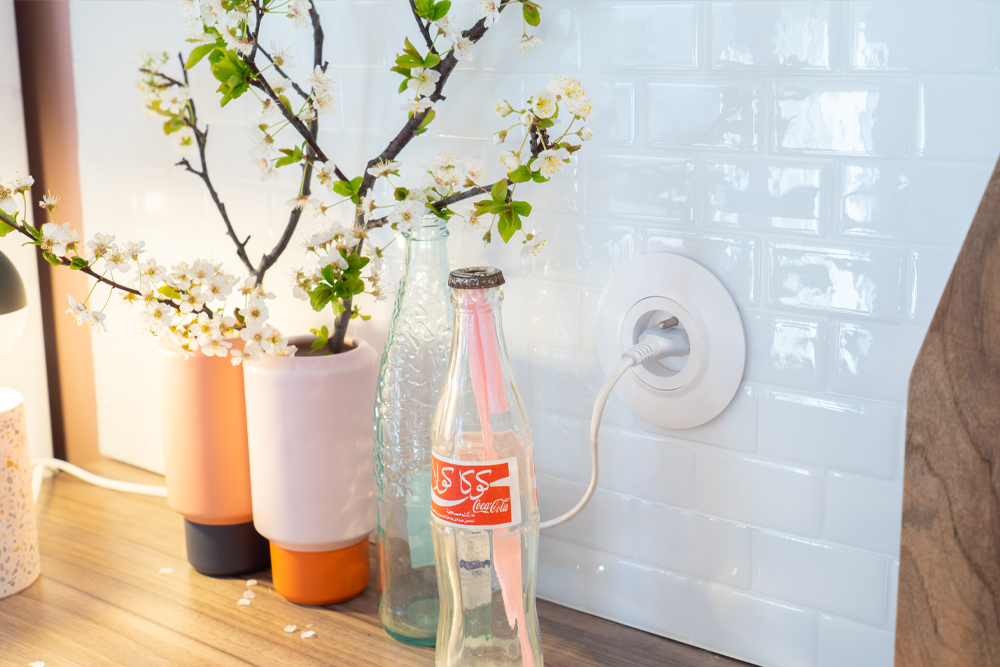
Another thing we are currently changing in the entire house are the power sockets: they had these ugly brass sockets that we’re updating to 2021. We really like the look of these new round ones:
What do you think? The cats love it too, hence the very well loved scratching thingie around the table leg 😉
Aaaaahhhh the frame of our painting looks nice:
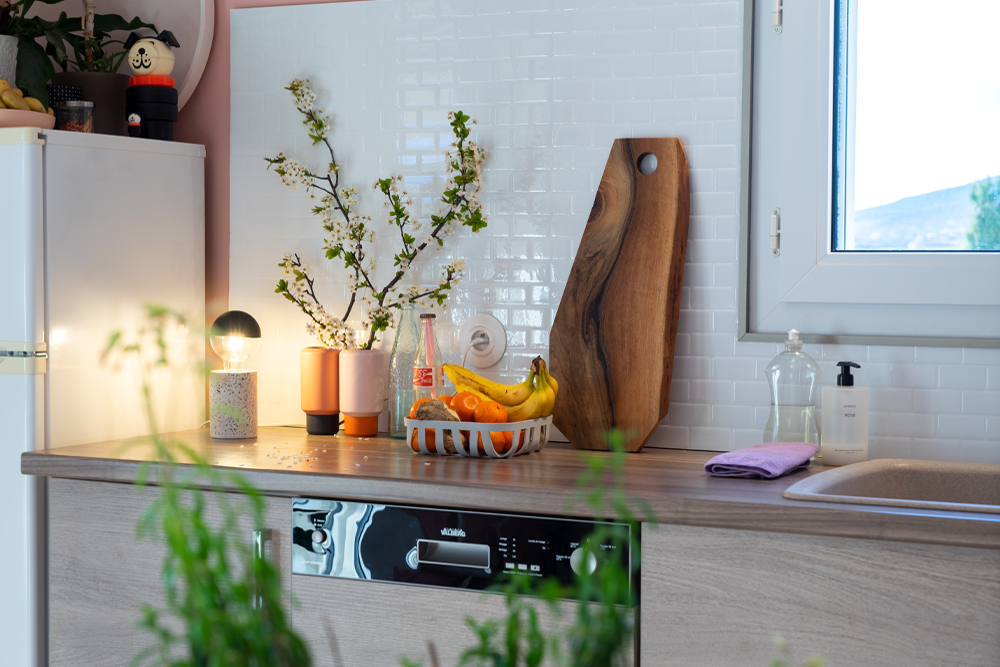
Thank you Smart Tiles for making out kitchen look so much better! I didn’t expect changing the backsplash would make such a big difference. But now looking back at the before pictures I can hardly recall what the kitchen looked like before. Crazy!
This blogpost was created in collaboration with Smart Tiles. As always all photos, opinions and words are my own. Thank you for supporting the brands that keep JOELIX.com going!


