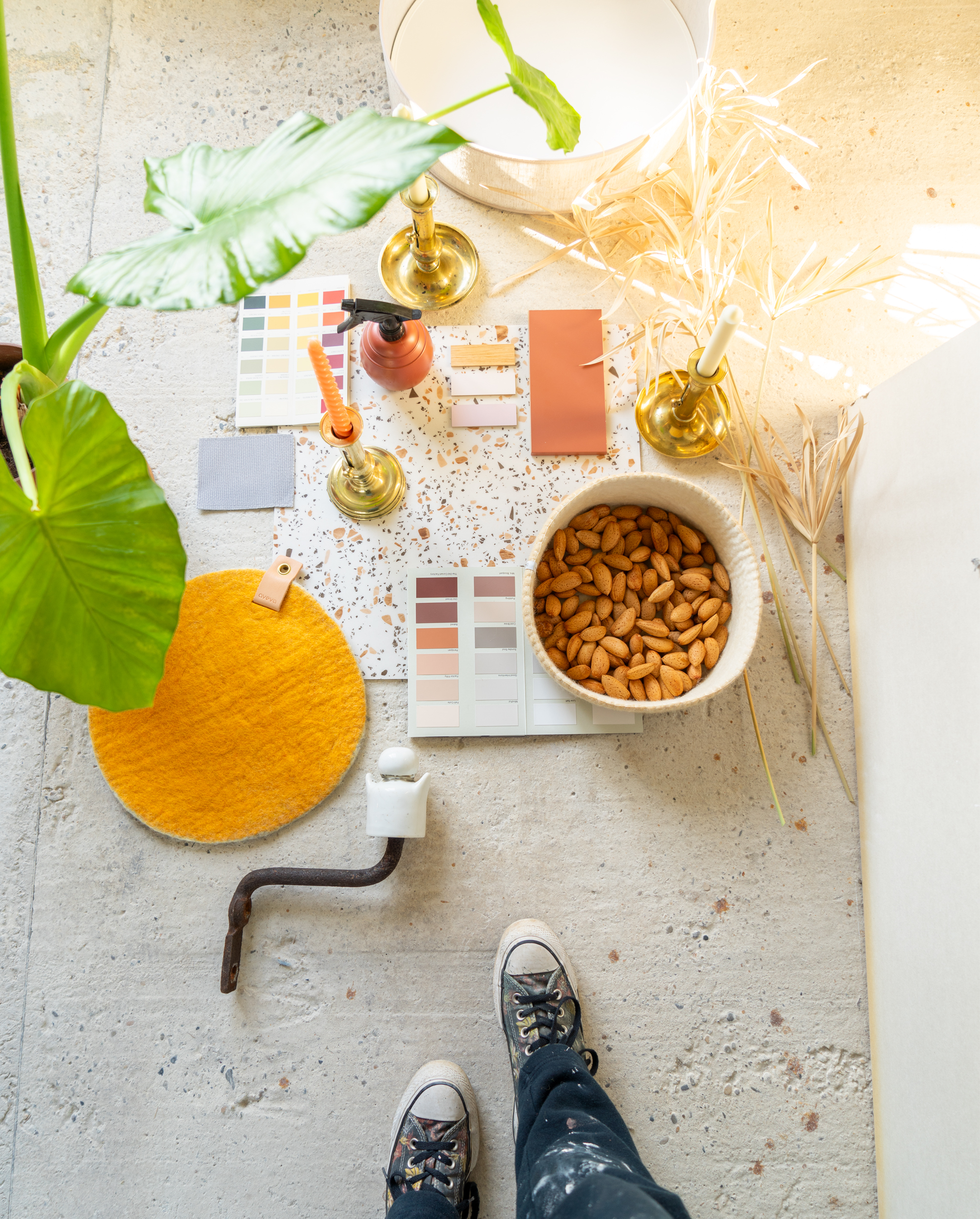
It all starts with a moodboard. Well not really, usually when starting to design a space, item, visual identity or anything really, it starts with a quick intuition. An idea, a color combo, a style, something visual. Then I start working and complete the project. But when I work in a team, or for a client that needs more reassurance at the start, a moodboard is the way to go. So for our Petite Maison Triangles I created a moodboard, it helps to discuss color choices, see what could work, what won’t. And it also gives us guidance and something more real to look forward to!
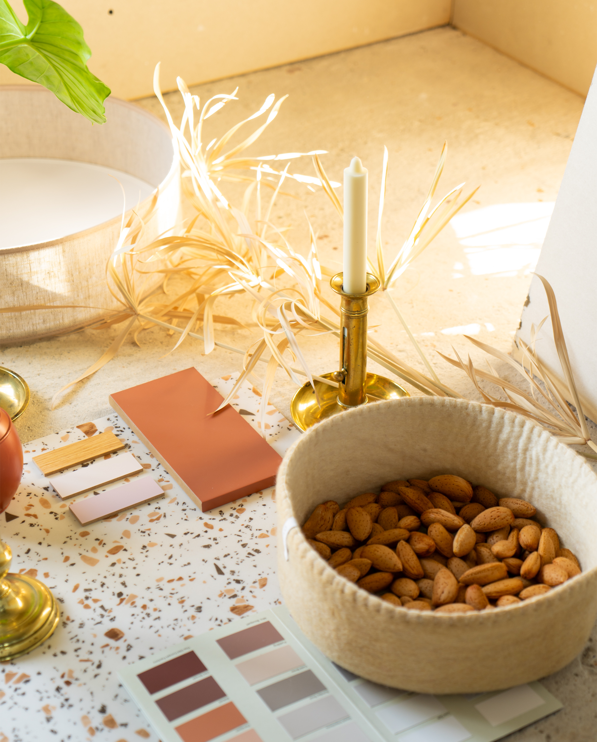
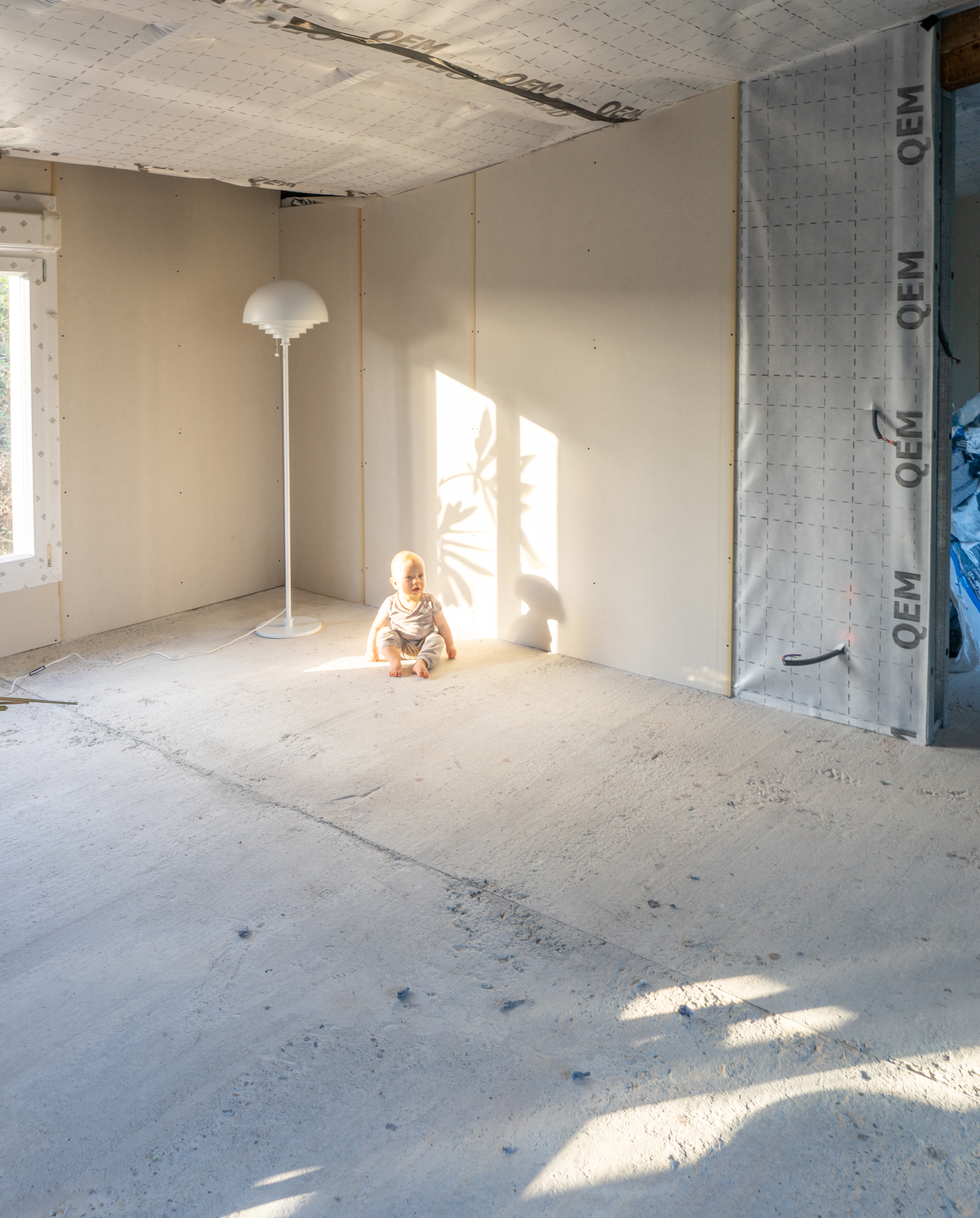
How do we go from a dark grey garage to a contemporary home? Our Petite Maison Triangles here in Ardèche, calls for a sunny bright color palette. 💛🧡🤍💗 So we’ve selected warm tones like terracotta, deep yellow, soft pink and natural materials that compliment the large collection of brass candle holders of Tobey’s grandpa. At the moment it’s still a white canvas, but oohhhh it will be so pretty!!
Included in this moodboard:
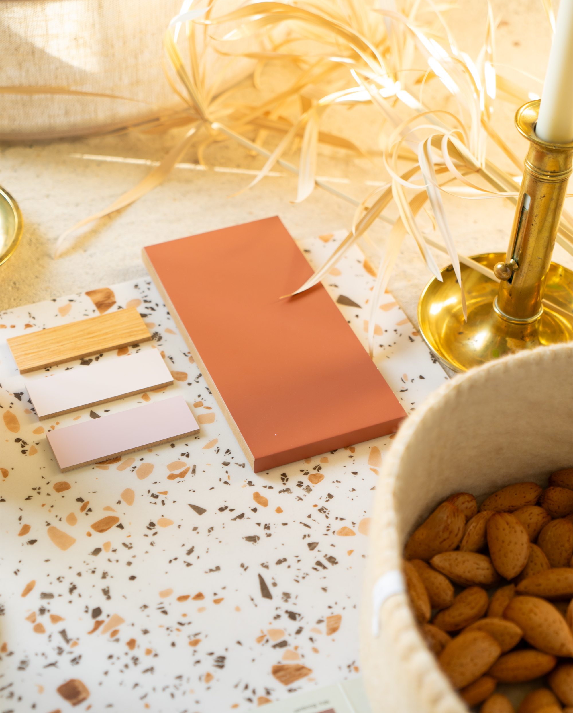
Southern vibes in the kitchen with the “Ochre du Lubéron” warm terracotta cover panels by @relookyourkitchen
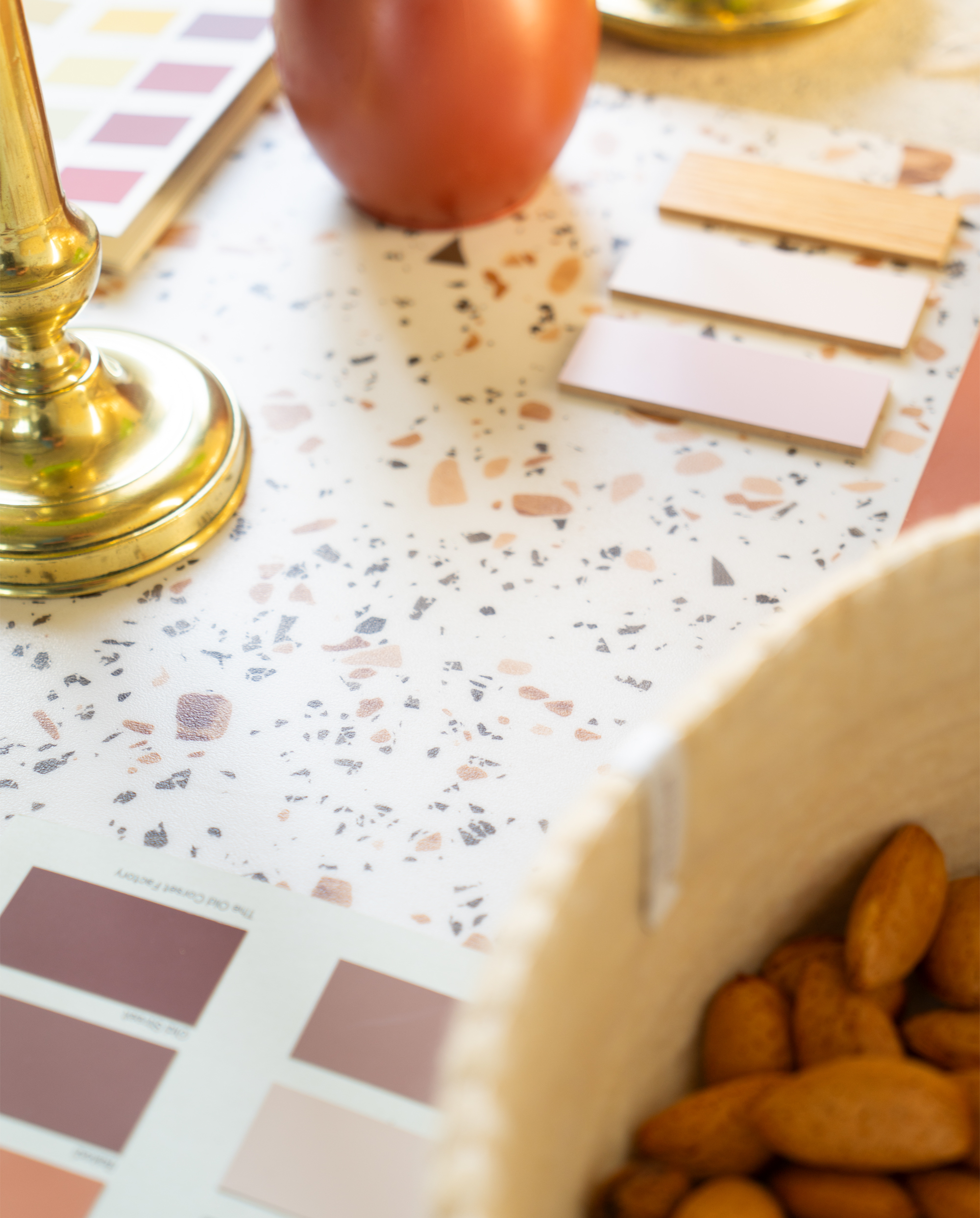
Warm jewel tones in the terrazzo floor by @forboflooringfr modul’up habitat terrazzo sépia
Cozy natural wool accessories from @avevadesign that are made from handfelted organic wool
The natural linen ceiling light from @belidlighting will shine a soft light into the hallway
Xala Chai water sprayer in copper from @capieurope
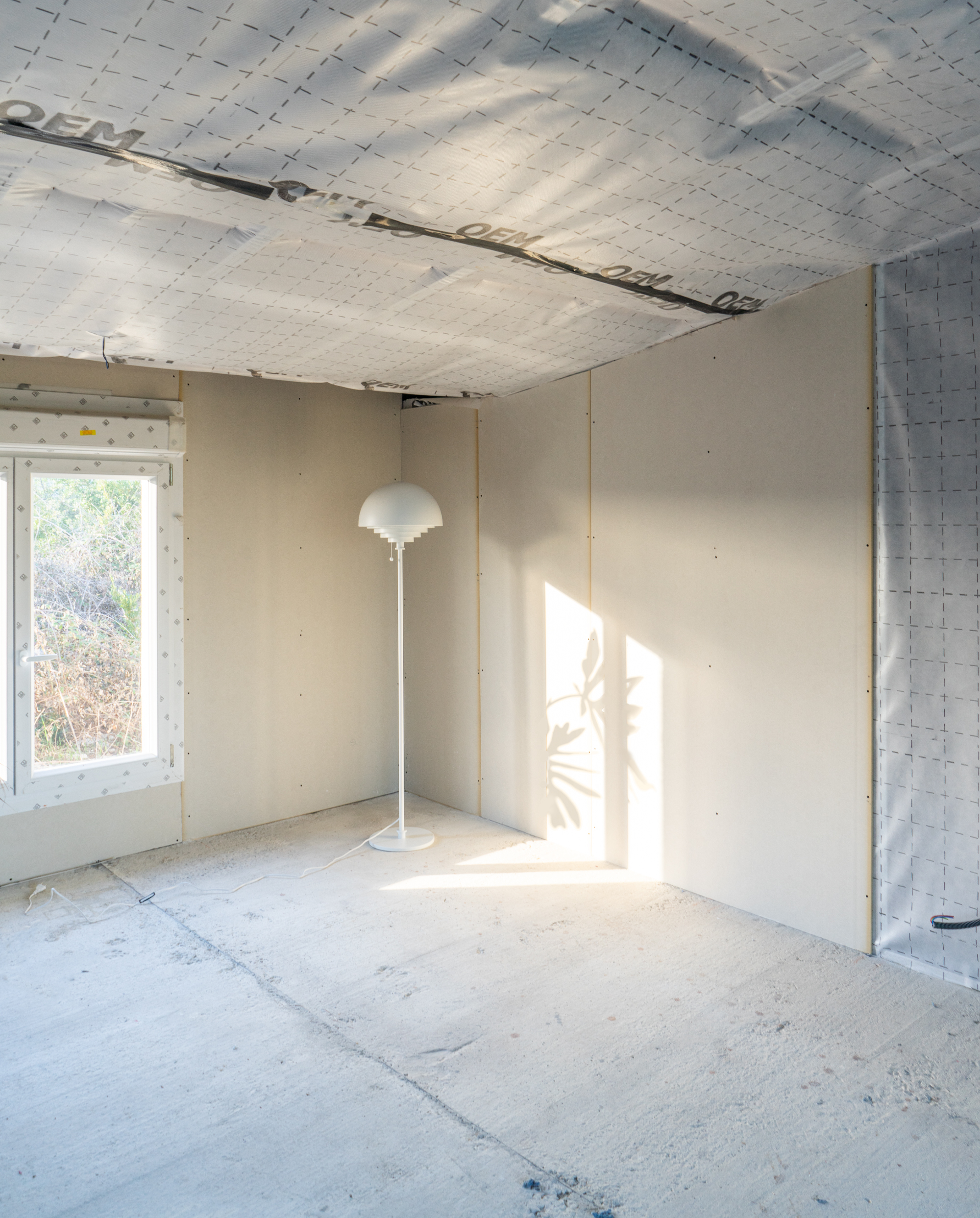
Also, how pretty is the @herstaldesign Motown floor lamp? Elegant with a touch of retro 👌 Can’t wait to see it shine in the living room soon!
Tobey approves:
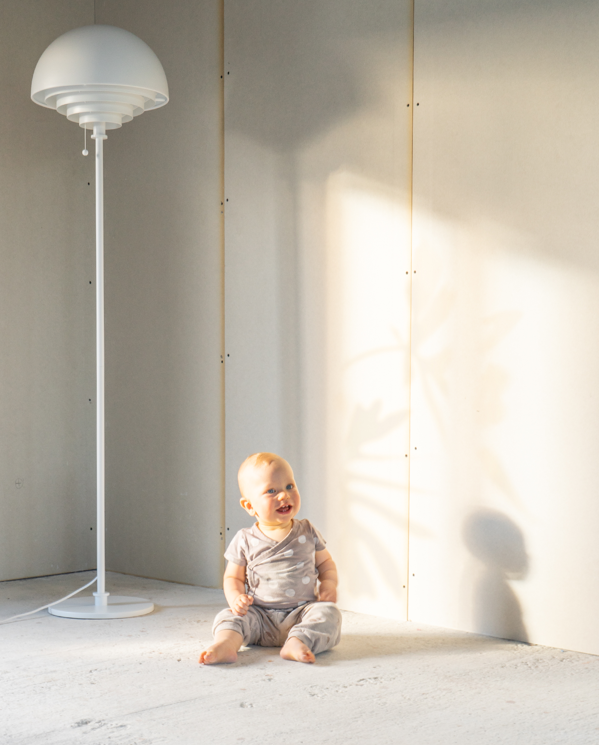
Sometimes when creating a moodboard everything comes together all naturally: the light in the living room compliments the color choices so well.
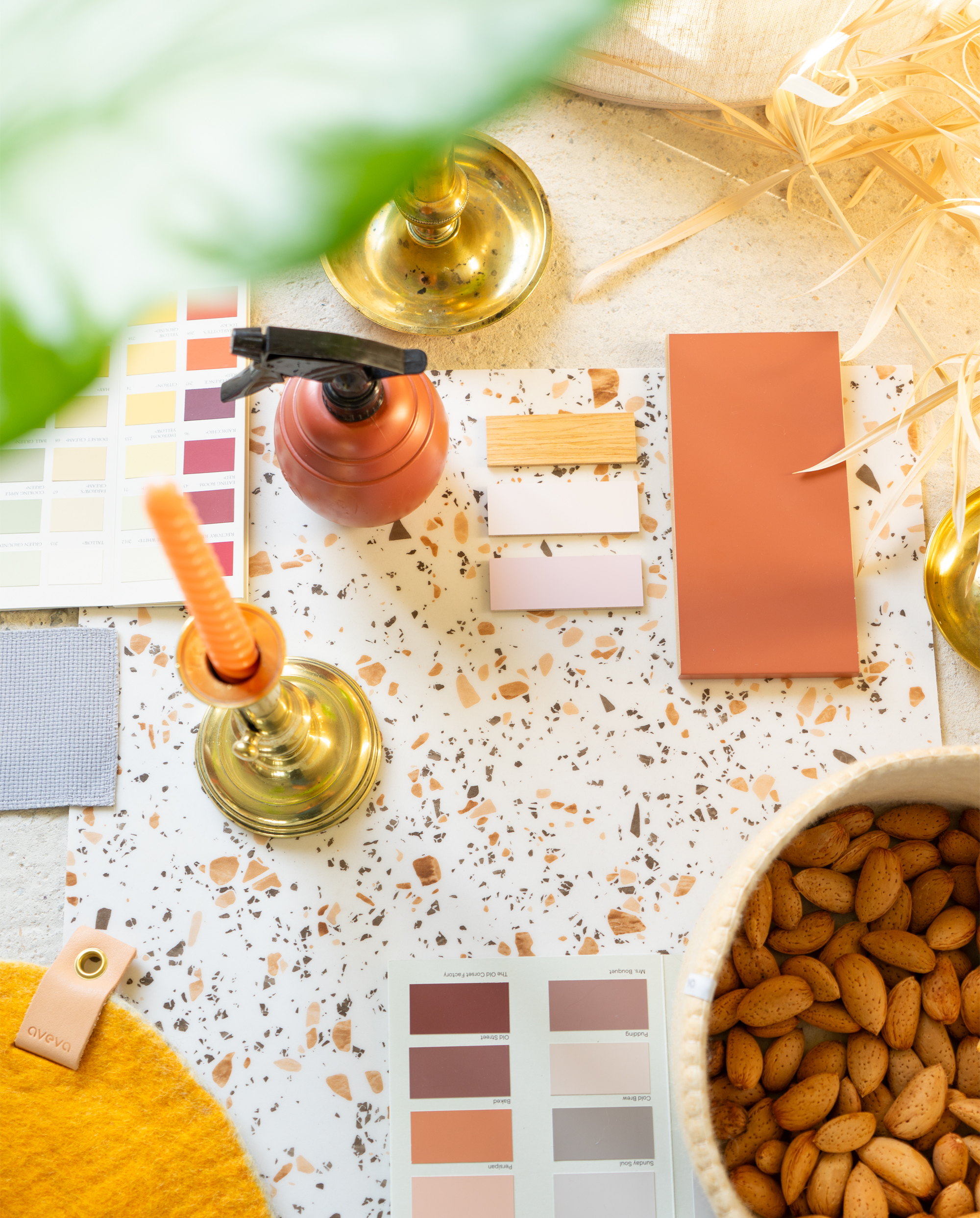
Still a white canvas, but not for long…
A peek of the “Ochre du Lubéron” warm terracotta cover panels by @relookyourkitchen :
In the next post I’ll share more about why we made these specific choices, why these brands, why these materials. Stay tuned!


